The idea behind a logo refresh all started in a small room where a group of us discussed the fact that our logo no longer spoke to who Snapshot was as a company or the quality of work we create. To begin brainstorming what our logo refresh looked like, we started by looking through what other companies in a similar position were using as their brand assets. We saw a lot of video specific companies using just their names and we saw a lot of specific logos around each company’s specific niche.
Then, a discussion was had about what we do specifically as a whole. Since we encompass so many different services we decided it would be best to create a logo around our name. From these discussions, we decided that the Snapshot “S” was the best thing to create a logo around because it’s something that can exist along with the name or all by itself. As you can see we created many an S and a few SSI’s which were later decided aren’t our thing.
![]()
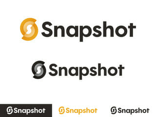
After many conversations and design sessions we landed on the encircled S icon as you see below:
![]()
One of the reasons we chose this is because speaks to the word “Snapshot” using two s’s. This helped with our move to make our name just Snapshot (with only one capital S). Within the icon, there is a capital S surrounding a small s. Another great thing about the logo is that it speaks to our targeted approach of helping each of our clients through the offset target. The designer also wanted to incorporate a current trend toward gradients while also being able to create an icon that can be simplified down to a single color if and when needed, really allowing the icon to be diverse in its uses.
![]()
After we selected the icon it was a tough decision to find a font that was similar to the icon while also speaking to our presence as an interactive company. We wanted a font that could be easily used on the web while also being unique to Snapshot. After much font exploration, we narrowed it down to Filson & Futura but decided that Futura is a bit too prevalent while also not being quite as personal to Snapshot. We then took the Filson type and edited it slightly to better suit the icon and thus making it more personal to the Snapshot brand. It was a lengthy process with discussions among design, animation, video, marketing, and leadership.
As you can see, it took a village to come up with our new logo and we are so happy with how it turned out! If you’re in need of a logo refresh, let us know. We can help you uncover new, meaningful ways to communicate who you are to your audience.