
Your website may get thousands of visitors every month, but are they completing the actions that you want? Let’s say you’ve just realized that the bulk of visitors scan your homepage and bounce right off, or maybe they’re going straight to your case studies? For most websites, the contact and service request forms are undeniably one of the most valuable areas on the page–the bullseye that you want your visitors to hit. This is the place where visitors become actual leads for your company, and on top of that you’ll receive the names and phone numbers of potential customers for future nurturing and marketing efforts.
But the fact is, people will fill out your form only after they’ve decided your company meets their needs and if they trust the product or service you provide. The first step is to clearly spell out what your company does and explain why people should be interested. Once you’ve done this, just having a form on your page isn’t enough; you have to make sure it’s in the right place, it’s the right size/color, asks the right questions, and is easy to understand. And with analytics, heat mapping, and event tracking you can see exactly how people interact with your forms and understand where to make any needed adjustments. If you want to be sure you’re doing the right things on your forms, here are 5 tips for you:
Keep It Above the Fold
User engagement is the highest on the area of the page that sits above the fold. So realistically, the things you really want your visitors to interact with should be near the top of the page. This includes your contact form, important video content, CTA buttons etc. It’s simple, people are more likely to interact with what’s readily viewable on a page, versus having to scroll down it. This doesn’t mean to throw all the important stuff up top and hope that people will travel down the page to figure out what all of it means. Rather, it’s more of a blend of what you want and what your visitors need.
This landing page uses an above the fold form:
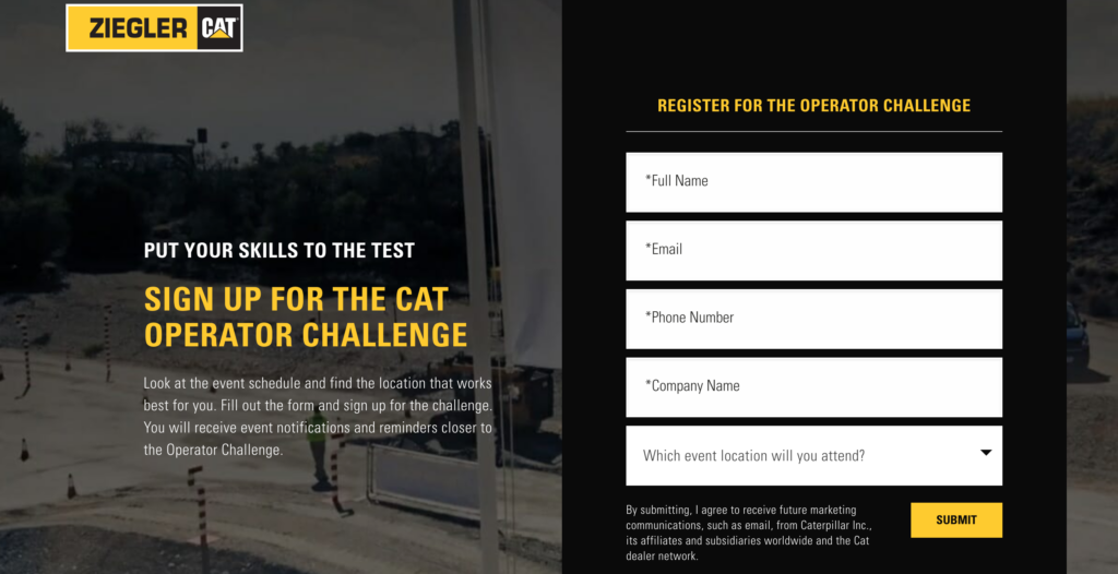
Be sure to inform people what the gist of the product, offer, or service is above the fold and also include a form, CTA, or video beside it. A brief paragraph on one half of the page and a form beside it is a good starting point. But, you can also experiment with putting a video on the upper left, a form at the upper right, and supporting copy below the fold. Either way, the takeaway here is that your forms should not be hidden, they should be visible without the user having to scroll way down the page. While this can get tricky with the limited amount of screen space on mobile, designing your page around a well-placed form is key.
Fewer Form Fields
What would you rather do, fill out 10 form fields or 5? Statistics tell the story–people are more likely to finish things when there’s less work involved. So as silly as it might sound, filling out a form is work, and filling out a bunch of fields is more work, and this can be enough to frustrate visitors. Think about your forms before you put them in place…what questions do you absolutely need people to answer and what things could you do without?
We’ve added tracking to all sorts of forms and have seen the data to back this suggestion up. Less form fields = more form fills. Oftentimes, there’s been one question that people stop filling the form out at, and for one reason or another people get to that one spot and decide to quit. What can you do about this? Ask if this question can be simplified or removed from the form. If so, eliminate it from your form and see if there’s an improvement in the completion rate.
Multiple Choice Dropdowns
Cut out the time it takes people to type their info into form fields and they’ll reward you with higher completion rates. Rather than asking “How can we help you?” and having people type in a custom response. Try asking that same question and provide people with a dropdown of answers to choose from. For example, if you’re a mechanic, the drop-down options might be: oil change, engine repair, check-up, new tires, etc. Keep in mind that you can always include “other” as an option to make sure you don’t trap anyone into a box.
Here’s an example of a multiple choice form field:
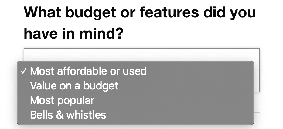
Of course, it’s not possible to provide multiple choice answers for every field on your form. Some of the personal info like a person’s name, phone number, and email address will have to be filled out manually. But outside of personal info, you can experiment with multiple choice options for just about everything else. You will want to limit the amount of multiple choice options as well, usually around 5 options works best.
Carefully Craft the CTA
The words you use on your CTA button have more of an impact than you might think. Some of the most common CTA buttons are “book now”, “submit”, “get a quote”, and “learn more” but these aren’t always the best options. In addition, green and blue are common colors for these buttons, but who’s to say these colors will perform the best? Depending on your business and the intended use for the form, craft a phrase for your button that’s more intuitive or relevant.
For things like services, try “schedule car service” and for downloads try “download free ebook”. If people can clearly see the end goal of filling out the form and the CTA is more exact, they will be more inclined to fill out the required info to click that button. In terms of button colors, this is where variable testing comes into play. Use the same form with a green button, blue button, and purple button and see if there’s a color that gets clicked the most. Likely, there will be.
Make It Visually Appealing
Forms are what they are: places for gathering information about potential customers. They are never really going to be fun to fill out, but they can be more than a big white square filled with plain white boxes. They can use a touch of color, small icons, playful or conversational language, and anything else you can think of to make them more intriguing. The process of filling out a form is pretty mundane, so adding a little bit of personality can be a breath of fresh air for your visitors.
Also, try adding a headline above your form that draws people in. Rather than “Contact Us” go for something like “Speak to a Local Representative” to let people know exactly what the end result of filling out the form will be. Essentially, your form doesn’t have to be cut and dry. Incorporate some of your brand’s personality into it and reflect the tone of the page into the form itself.
Test, Test, and Test Again
The most important thing to remember is to test the heck of your forms. Create multiple versions that use different colors, verbiage, shapes, and order and let them run against each other for a month or two. Try not to create a form and assume it’s the best version, use data to back up your decisions and test multiple versions of everything.
Need help creating and testing your website’s forms? We can help.